React Select: The complete guide

This article was originally published on the Metered blog: React Select: The complete guide
In this article we are going to learn about the react select library and how you can use it in your project. Here is what we are going to learn in this article
Setting up the environment and installing the React Select
Basic Implementation of React Select with code examples
Styling the React Select with the styles prop
Customizing the theme Object
Handling Complex data structures like Grouped, Nested and Custom Select options
Asynchronous Options: Fetching options from an API
Accessibility and Performance Enhancements
Setting up the environment
Open the root folder of your react application, For this article I am going to use the code sandbox to show you how the react select library works
then in the root folder install the react select library like this
npm install react-select
You can also use yarn to install the react select library like
yarn add react-select
then open the project in your code editor.
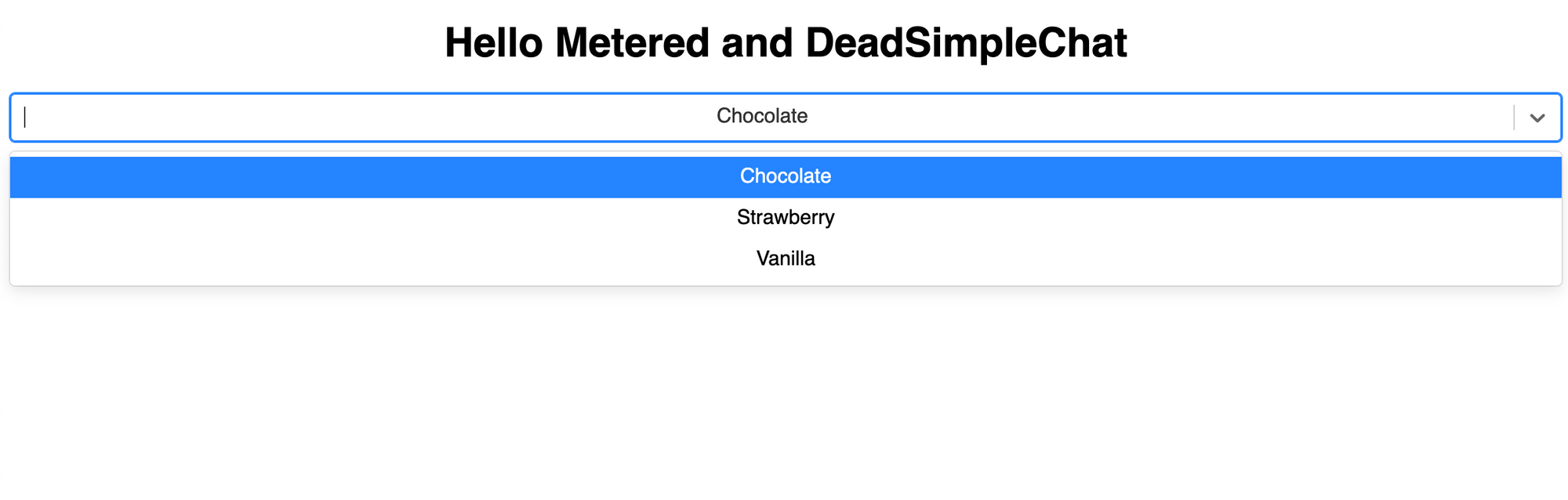
Now you have installed the react select library in your project. Next, let us create a simple dropdown
Basic implementation of react select library
In this section we are going to implement a basic functionality for the react select library
Open the App.js and import the react from react and import the Select from the react-select library
then in the App(){} function create an Array of Objects with value and label and name it options like so
 const options = [
    { value: 'chocolate', label: 'Chocolate' },
    { value: 'strawberry', label: 'Strawberry' },
    { value: 'vanilla', label: 'Vanilla' }
  ];
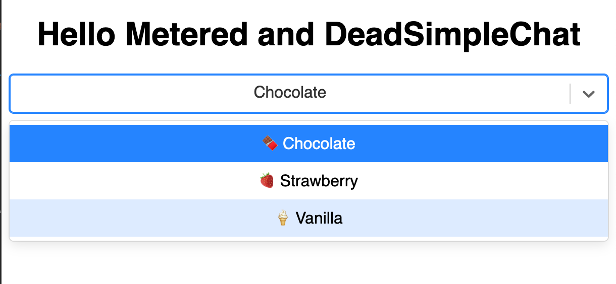
than in the return section create a html <Select> tag and give the options = {options} like so
<Select options={options} />
the complete code looks like
import "./styles.css";
import React from "react";
import Select from "react-select";

export default function App() {
  const options = [
    { value: "chocolate", label: "Chocolate" },
    { value: "strawberry", label: "Strawberry" },
    { value: "vanilla", label: "Vanilla" },
  ];

  return (
    <div className="App">
      <h1>Hello Metered and DeadSimpleChat</h1>
      <Select options={options} />
    </div>
  );
}
Styling React Select with the Styles prop
The styles prop accepts an object in which the key are style names of different style components and the values are functions that return style Objects
the parts of the select component might include control, menu option, dropdown and other different parts
Let us consider an example of customizing control and options with the styles prop
import React from 'react';
import Select from 'react-select';

const customStyles = {
  control: (provided) => ({
    ...provided,
    backgroundColor: 'lightgray',
    padding: '5px 10px',
    border: '1px solid black',
    boxShadow: '0 2px 4px rgba(0,0,0,.2)',
  }),
  option: (provided, state) => ({
    ...provided,
    borderBottom: '1px dotted pink',
    color: state.isSelected ? 'white' : 'black',
    backgroundColor: state.isSelected ? 'hotpink' : 'white',
  }),
};

function App() {
  const options = [
    { value: 'chocolate', label: 'Chocolate' },
    { value: 'strawberry', label: 'Strawberry' },
    { value: 'vanilla', label: 'Vanilla' }
  ];

  return (
    <Select options={options} styles={customStyles} />
  );
}

export default App;
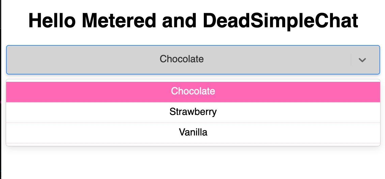
What are we doing here?
Here we have the control style function. This function changes the look of the select control
We have set the backgroundColor to lightgray, we have provided some padding and border and have given a boxShadow as well.
We have to also customize the options, here we have the option function in which we also have the state.
here we have border that is pink and we have the color and the backgroundColor changed depending on the state of being selected or not selected
Customizing the theme
Using React select you can also customize the theme, You can merge the custom theme object with the default theme
This can be used to ensure that the colors font size and other details are consistant across the selects
import React from 'react';
import Select from 'react-select';

function App() {
  const options = [
    { value: 'chocolate', label: 'Chocolate' },
    { value: 'strawberry', label: 'Strawberry' },
    { value: 'vanilla', label: 'Vanilla' }
  ];

  const customTheme = (theme) => ({
    ...theme,
    borderRadius: 0,
    colors: {
      ...theme.colors,
      primary25: 'lightblue', // change Background color of options on hover
      primary: 'darkblue', // change the Background color of the selected option
    },
  });

  return (
    <Select options={options} theme={customTheme} />
  );
}

export default App;
import "./styles.css";
import React from "react";
import Select from "react-select";

const customStyles = {
  control: (provided) => ({
    ...provided,
    backgroundColor: "lightgray",
    padding: "5px 10px",
    border: "1px solid black",
    boxShadow: "0 2px 4px rgba(0,0,0,.2)",
  }),
  option: (provided, state) => ({
    ...provided,
    borderBottom: "1px dotted pink",
    color: state.isSelected ? "white" : "black",
    backgroundColor: state.isSelected ? "hotpink" : "white",
  }),
};

export default function App() {
  const options = [
    { value: "chocolate", label: "Chocolate" },
    { value: "strawberry", label: "Strawberry" },
    { value: "vanilla", label: "Vanilla" },
  ];

  const customTheme = (theme) => ({
    ...theme,
    borderRadius: 0,
    colors: {
      ...theme.colors,
      primary25: "lightblue", // Background color of options on hover
      primary: "darkblue", // Background color of the selected option
    },
  });

  return (
    <div className="App">
      <h1>Hello Metered and DeadSimpleChat</h1>
      <Select options={options} theme={customTheme} />
    </div>
  );
}
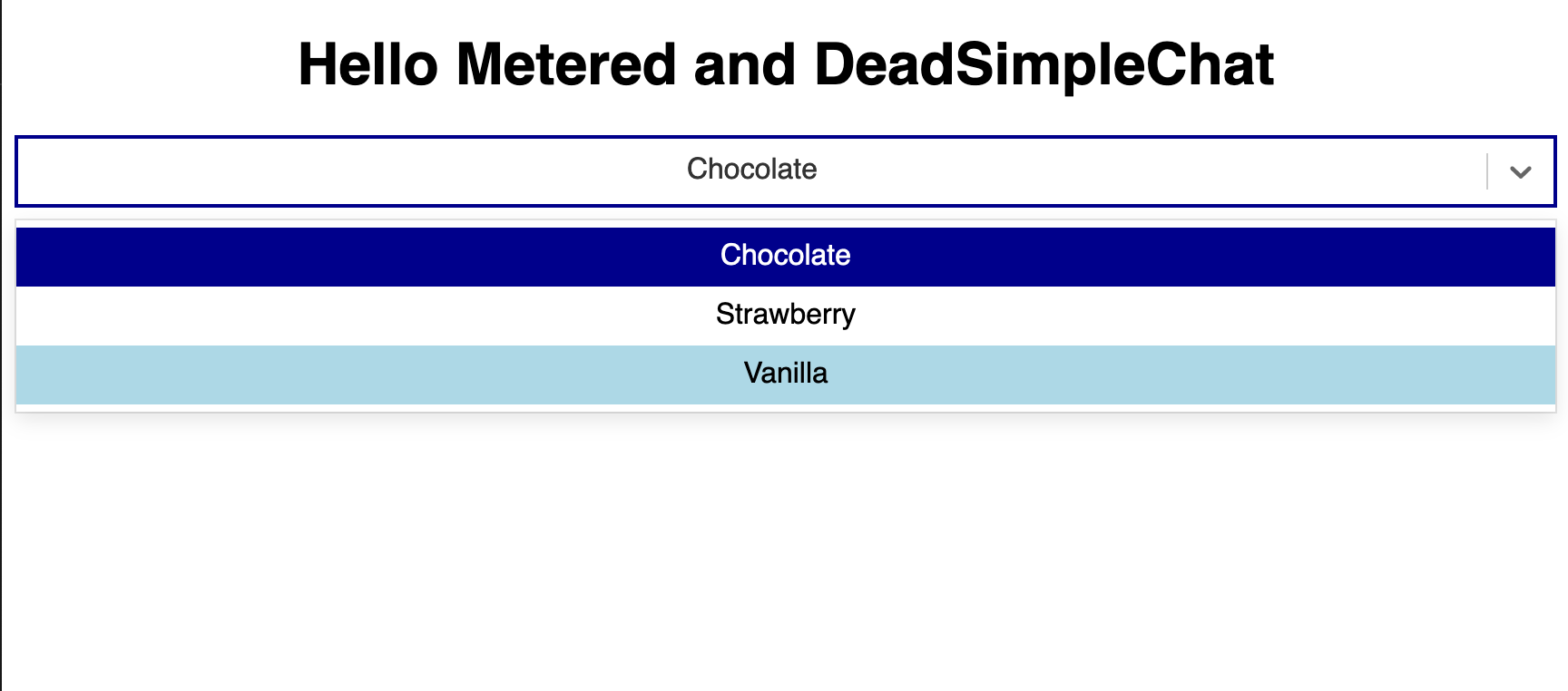
The theme function which here is the customTheme() function. This function gets the default theme Object
This function returns a new theme object with the custom values overridden. For example here we are changing the colors Object to change on hove and we are also changing the selected backgroudColor value.
The above exaples show how we can use the styles prop with theme customization to style the react select components
React Select: Handling Complex Data Structures
- Grouped Options
Grouped options lets you categorize related options under a common label. This is mostly used for user navigation and selection and for creating long lists of options
Let us consider and example of implementing grouped options
import "./styles.css";
import React from "react";
import Select from "react-select";

export default function App() {
  const groupedOptions = [
    {
      label: "Fruits",
      options: [
        { value: "apple", label: "Apple" },
        { value: "orange", label: "Orange" },
        { value: "banana", label: "Banana" },
      ],
    },
    {
      label: "Vegetables",
      options: [
        { value: "carrot", label: "Carrot" },
        { value: "broccoli", label: "Broccoli" },
        { value: "onion", label: "Onion" },
      ],
    },
  ];

  return (
    <div className="App">
      <h1>Hello Metered and DeadSimpleChat</h1>
      <Select options={groupedOptions} />
    </div>
  );
}
- Grouped Options Structure: the options are arranged in an array of Objects, where each option is an Object with a label as key and an array of Objects as value like so
const groupedOptions = [
  {
    label: 'Fruits',
    options: [
      { value: 'apple', label: 'Apple' },
      { value: 'orange', label: 'Orange' },
      { value: 'banana', label: 'Banana' },
    ],
  },
  {
    label: 'Vegetables',
    options: [
      { value: 'carrot', label: 'Carrot' },
      { value: 'broccoli', label: 'Broccoli' },
      { value: 'onion', label: 'Onion' },
    ],
  },
];
Select component handles the grouped options natively. You just need to pass the groupedoptions array to the options prop and the library will render the options grouped under their respective labels.
- Nested Dropdowns:
Nested dropdowns or submenus are not directly supported by the react select library but can be simulated by using custom components.
- Custom Options components
Custom options component allow you to render options using custom JSX, this enables you to display complex data structures and the includion of additonal elements such as icons
let us consider an example of implementing custom options component
import React from 'react';
import Select, { components } from 'react-select';

const options = [
  { value: 'chocolate', label: 'Chocolate', icon: '🍫' },
  { value: 'strawberry', label: 'Strawberry', icon: '🍓' },
  { value: 'vanilla', label: 'Vanilla', icon: '🍦' }
];

const CustomOption = (props) => {
  return (
    <components.Option {...props}>
      <span>{props.data.icon}</span> {props.children}
    </components.Option>
  );
};

function App() {
  return <Select options={options} components={{ Option: CustomOption }} />;
}

export default App;
there is a components.Option built in component in the react select library. Here we have a CustomOption component that uses the components.option to customize how each option is rendered.
Here we are adding an emoji icon using the customization.option component
Usability: Custom component is passed to the Select Component through the components prop and we are specifying that the CustomOption component should override the default Option component
In the options array we have the icon property for each option (that contains an emoji for the option). This icon property is used by the CustomOption component to render the icon next to the label
Asynchronous Options: Fetching options from an API
Many times you need to fetch options using an API and render them in real time. React Select gives you the ability to do this.
The use-cases involved include instances where the data set is too large to be downloaded all at once and options depending on what user has choosen or selected somewhere else are rendered in real time
We will use a simple pre built API endpoint to explain the example for you. This API will give you an array of options that you can use to render in your select options bar
Let us consider an example of asynchronous select options
In this example we are going to use the jsonplaceholder.com for our rest api. We are going to get the users and show them in our select dropdown
import "./styles.css";
import React, { useState, useEffect } from "react";
import Select from "react-select";
import axios from "axios";

export default function App() {
  const [options, setOptions] = useState([]);

  useEffect(() => {
    const fetchOptions = async () => {
      try {
        const response = await axios.get(
          "https://jsonplaceholder.typicode.com/users",
        );
        const userOptions = response.data.map((user) => ({
          value: user.id, // using user's ID as the value
          label: user.name, // using user's name as the label
        }));
        setOptions(userOptions);
      } catch (error) {
        console.error("Error fetching data: ", error);
      }
    };
    fetchOptions();
  }, []);
  return (
    <div className="App">
      <h1>Hello Metered and DeadSimpleChat</h1>
      <Select options={options} />
    </div>
  );
}
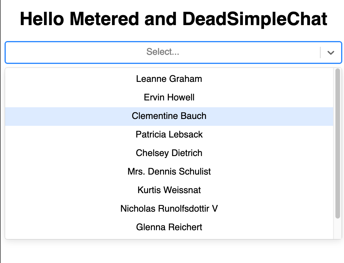
What are we doing here?
When our component mounts it fetches the user data from the jsonplaceholder.com and then we transform the data that we recieve in to the format that is required by the react select library
We are creating an array of option, in which each options value is the user's id and the label is the user's name
We are using the axios library to async fetch user's data from the jsonplaceholder api
the setOptions functions updates the components state when the data is received from the API and makes the data available for rendering the Select component, thus making the options appear on the screen
Some best practices and consideration when implementing async options
Handling loading states: Consider implementing loading states when bringing data from an api, the remote server might take some time to render or there might be network issues. So implement loading states indicating that the options are being loaded at this point in time
Error handling: Try to include error handling as well, when issues arise you should be able to show to the user that something has happened and the options are unavailable at the moment
Security and CORS: In this example we are using an external api that is designed for testing purposes by in production ensure that there is proper CORS configuration enabled and the endpoints are secure.
Accessibility and Performance Enhancements
The Aria specification enables you to make web content more accessible. The react select library already implements many ARIA attributes by default, but you can also enhance these features by a few minor tweaks
role="combobox": This indicates that the element is a widget, that is made up of a dropdown and a single line textboxaria-haspopup="listbox": Indicates that when you interact with the combobox it shows up a listbox popuparia-selected,aria-haspopup,aria-expandedandaria-selectedare automatically managed by the react select based on user interaction
Metered TURN servers
API: TURN server management with powerful API. You can do things like Add/ Remove credentials via the API, Retrieve Per User / Credentials and User metrics via the API, Enable/ Disable credentials via the API, Retrive Usage data by date via the API.
Global Geo-Location targeting: Automatically directs traffic to the nearest servers, for lowest possible latency and highest quality performance. less than 50 ms latency anywhere around the world
Servers in 12 Regions of the world: Toronto, Miami, San Francisco, Amsterdam, London, Frankfurt, Bangalore, Singapore,Sydney, Seoul
Low Latency: less than 50 ms latency, anywhere across the world.
Cost-Effective: pay-as-you-go pricing with bandwidth and volume discounts available.
Easy Administration: Get usage logs, emails when accounts reach threshold limits, billing records and email and phone support.
Standards Compliant: Conforms to RFCs 5389, 5769, 5780, 5766, 6062, 6156, 5245, 5768, 6336, 6544, 5928 over UDP, TCP, TLS, and DTLS.
Multi‑Tenancy: Create multiple credentials and separate the usage by customer, or different apps. Get Usage logs, billing records and threshold alerts.
Enterprise Reliability: 99.999% Uptime with SLA.
Enterprise Scale: With no limit on concurrent traffic or total traffic. Metered TURN Servers provide Enterprise Scalability
50 GB/mo Free: Get 50 GB every month free TURN server usage with the Free Plan
Runs on port 80 and 443
Support TURNS + SSL to allow connections through deep packet inspection firewalls.
Support STUN
Supports both TCP and UDP

Need Chat API for your website or app
DeadSimpleChat is an Chat API provider
Add Scalable Chat to your app in minutes
10 Million Online Concurrent users
99.999% Uptime
Moderation features
1-1 Chat
Group Chat
Fully Customizable
Chat API and SDK
Pre-Built Chat


